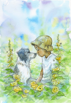
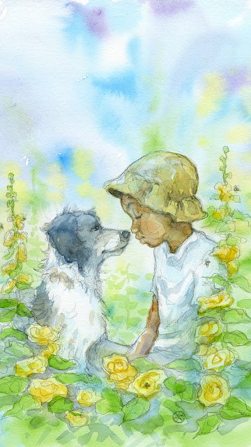
Here's the finished painting, added a bit of ink lines. Extra space on top for text or header.
This is the original photo.
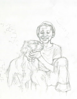
First I tried to follow the photo closely.
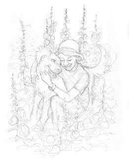
Maybe if I changed their positions?
It's kind of decorative and very sweet. Maybe if I paint it...
Too sweet.
Also, I didn't like his face.
The hollyhocks were now too distracting.
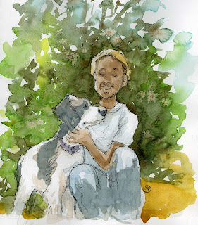
Maybe looser? Less attention to the hollyhocks? And a bit of loose ink at the end.
Straight to paint, not much pencil and didn't scan the pencil.
Better.
Still not 100% happy with it, though.
I decided to try & capture the emotion more than the photo.
Maybe the boy is younger?
This felt right. Much simpler. Equal weight/attention on boy and dog. Hollyhocks are just there, not distracting.




No comments:
Post a Comment